
Stef
Stef
Creative Designer
Creative Designer
Creative Designer
BRAND
BRAND
GRAPHICS
GRAPHICS
MARKETING
MARKETING
Transportation Design & Wayfinder Initiation
Transportation Design & Wayfinder Initiation
Transportation Design & Wayfinder Initiation

Client
Client
ART Stations
ART Stations
Industry Type
Industry Type
Self Initiation
Self Initiation
Team Credits
Team Credits
Stef & Bez
Stef & Bez
[THE OUUTCOME]
[THE OUUTCOME]
[ABOUT THEE PROJECT]
[ABOUT THEE PROJECT]
What if we designed a station?
What if we designed a station?
What if we designed a station?
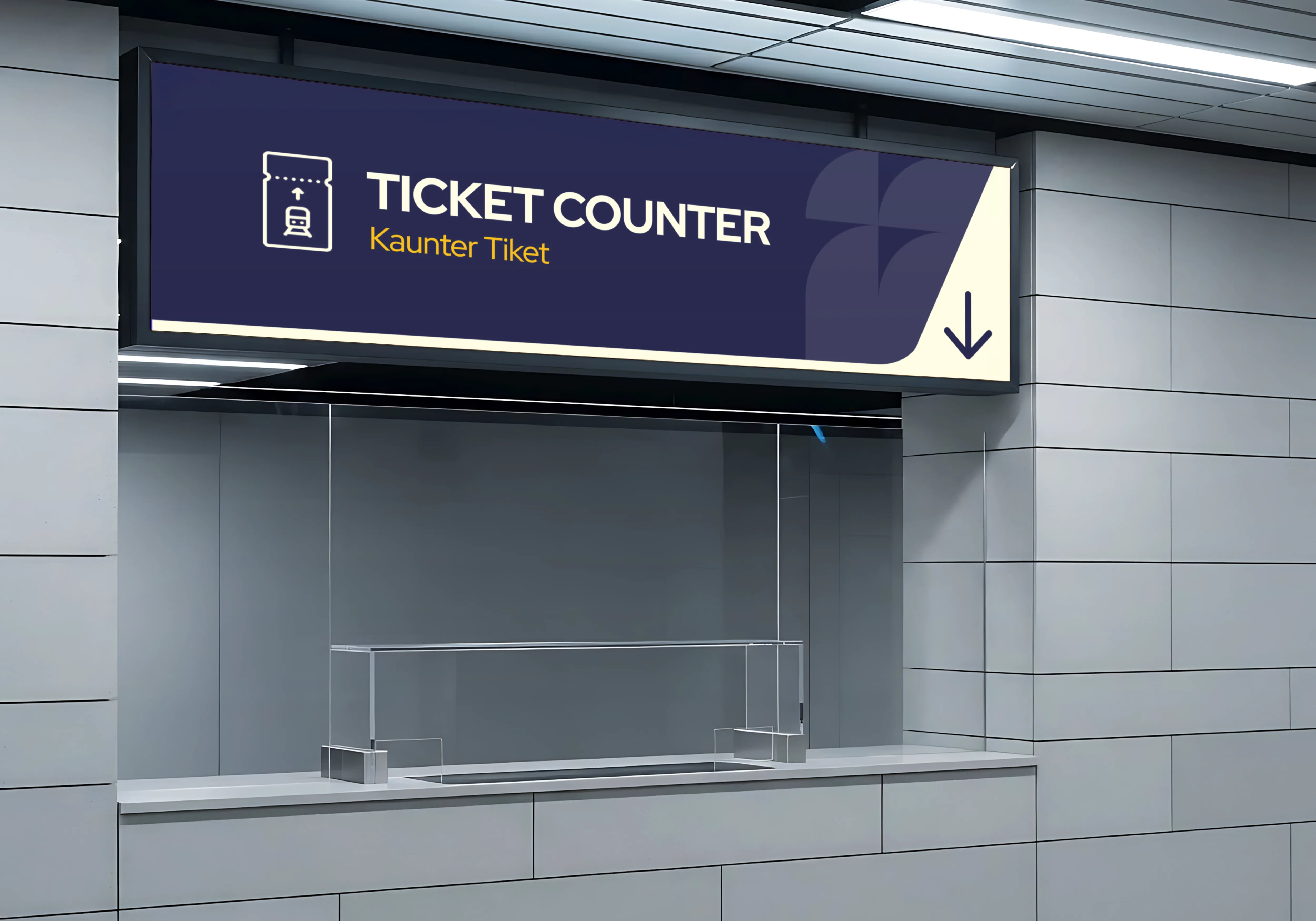
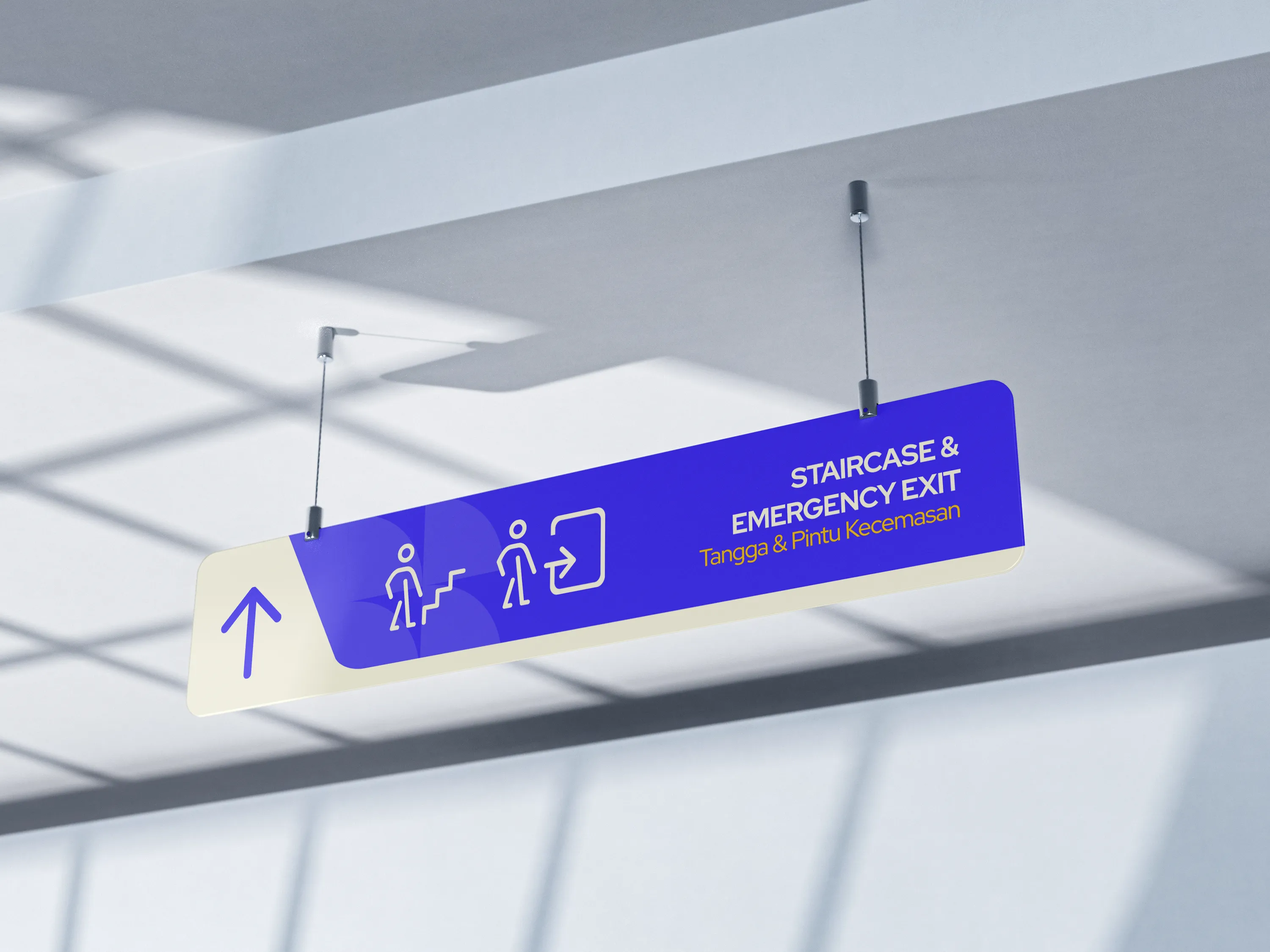
Simple, effortless, and scalable. Each element was designed to help passengers know where to go at a glance. The ultimate goal was to create something that feels modern and distinctly connected to the Sarawak urban transport experience, while still being clear and easy for everyone to understand.
Simple, effortless, and scalable. Each element was designed to help passengers know where to go at a glance. The ultimate goal was to create something that feels modern and distinctly connected to the Sarawak urban transport experience, while still being clear and easy for everyone to understand.
Simple, effortless, and scalable. Each element was designed to help passengers know where to go at a glance. The ultimate goal was to create something that feels modern and distinctly connected to the Sarawak urban transport experience, while still being clear and easy for everyone to understand.
[HIGHLIGHTS]
[HIGHLIGHTS]
By keeping the design clean, bold and easy to spot, the system helps passengers find their way with less confusion while giving the station a more welcoming and recognizable identity.
By keeping the design clean, bold and easy to spot, the system helps passengers find their way with less confusion while giving the station a more welcoming and recognizable identity.
By keeping the design clean, bold and easy to spot, the system helps passengers find their way with less confusion while giving the station a more welcoming and recognizable identity.
[OUTCCOME]
[OUTCCOME]
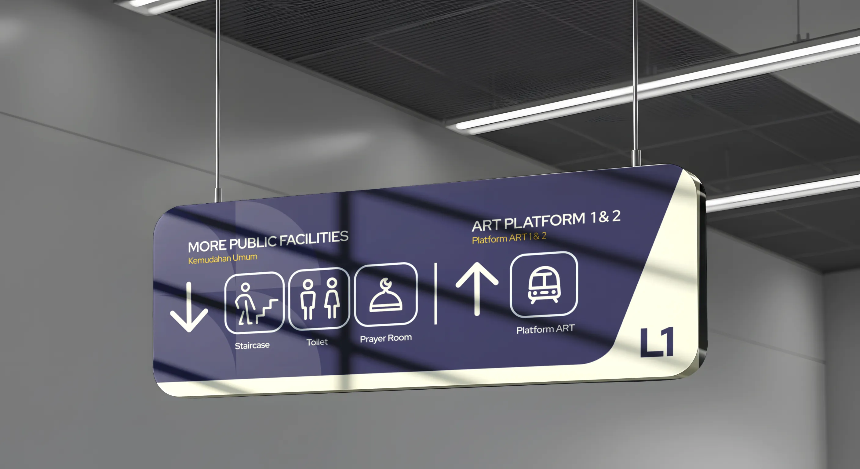
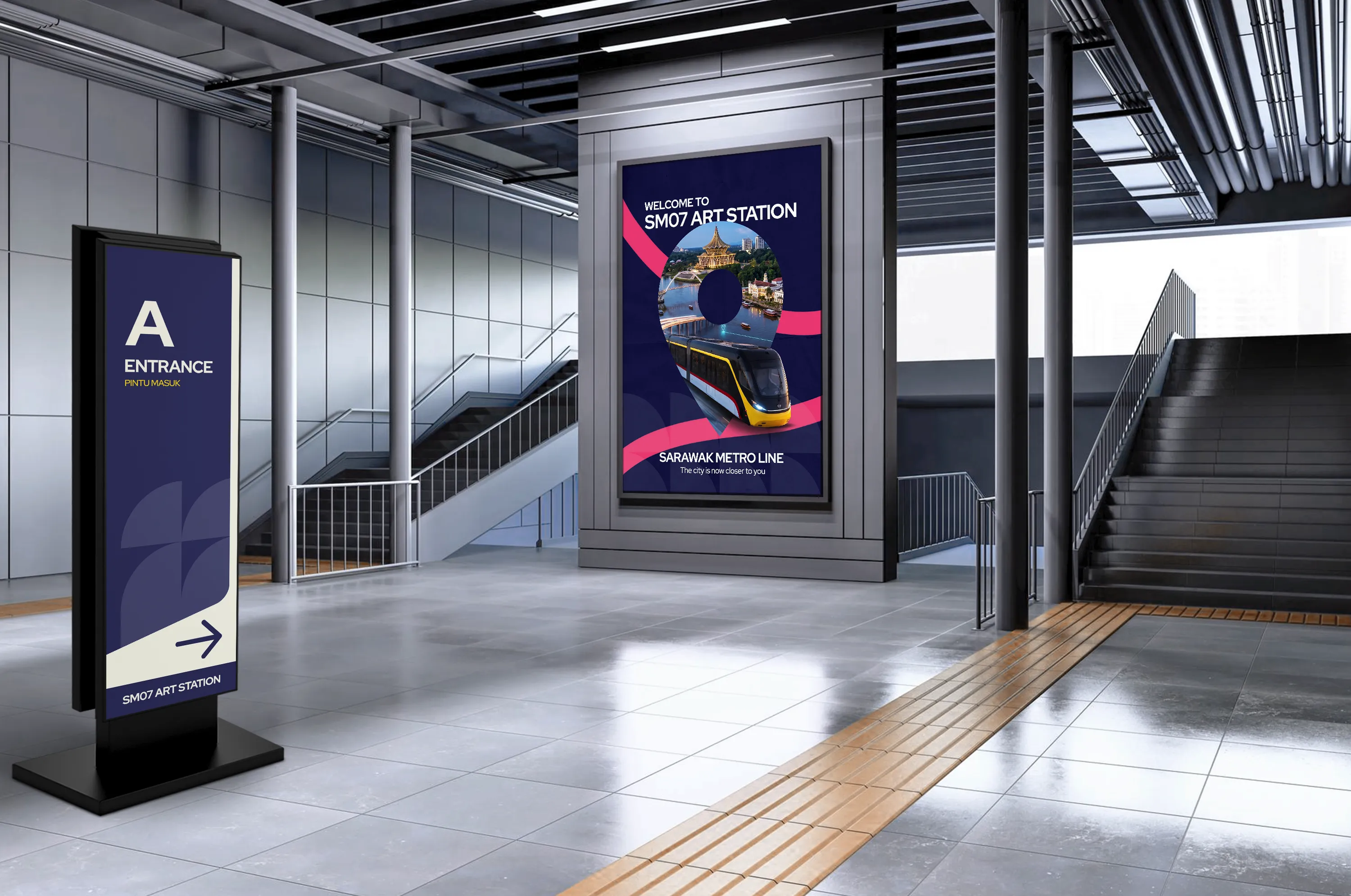
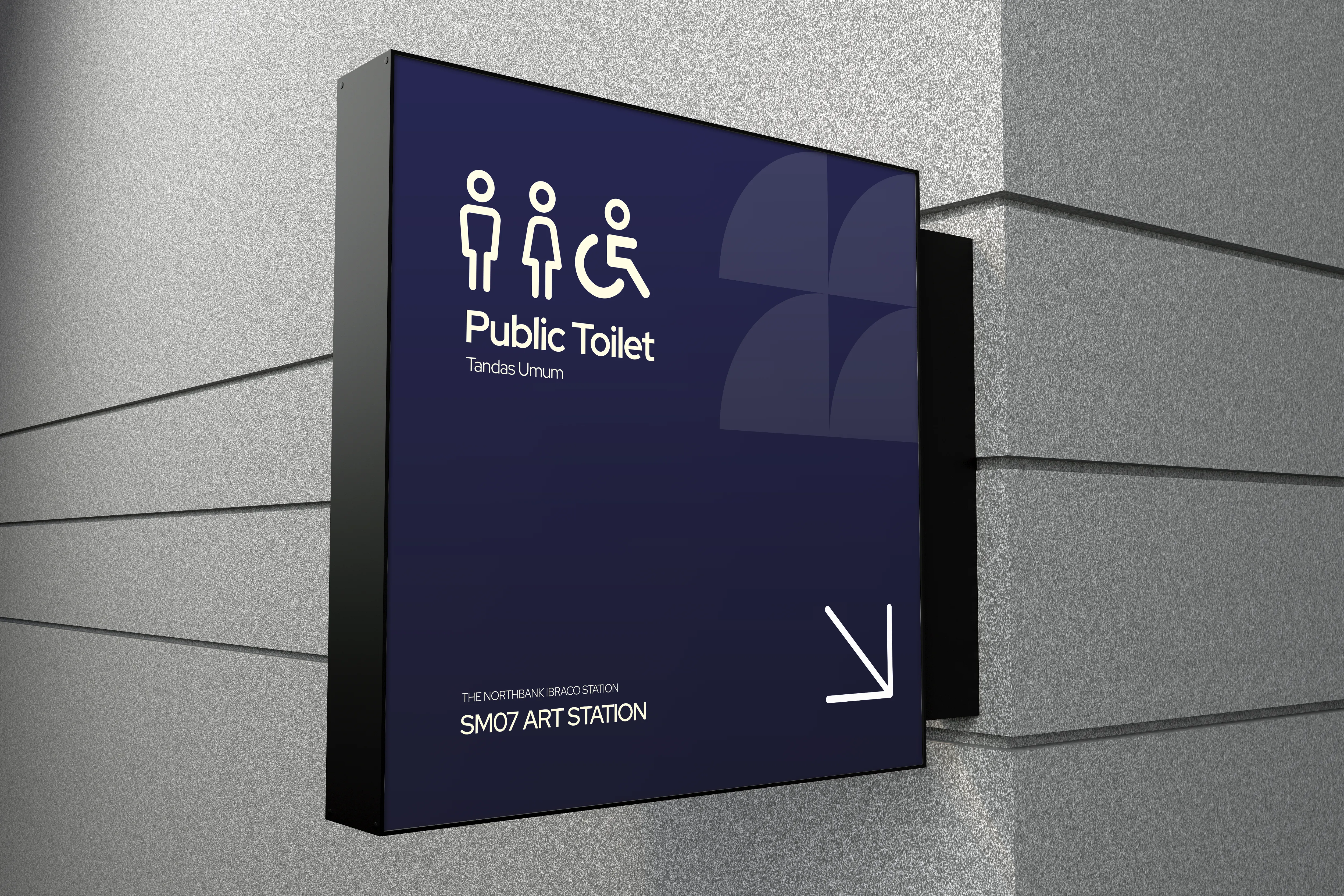
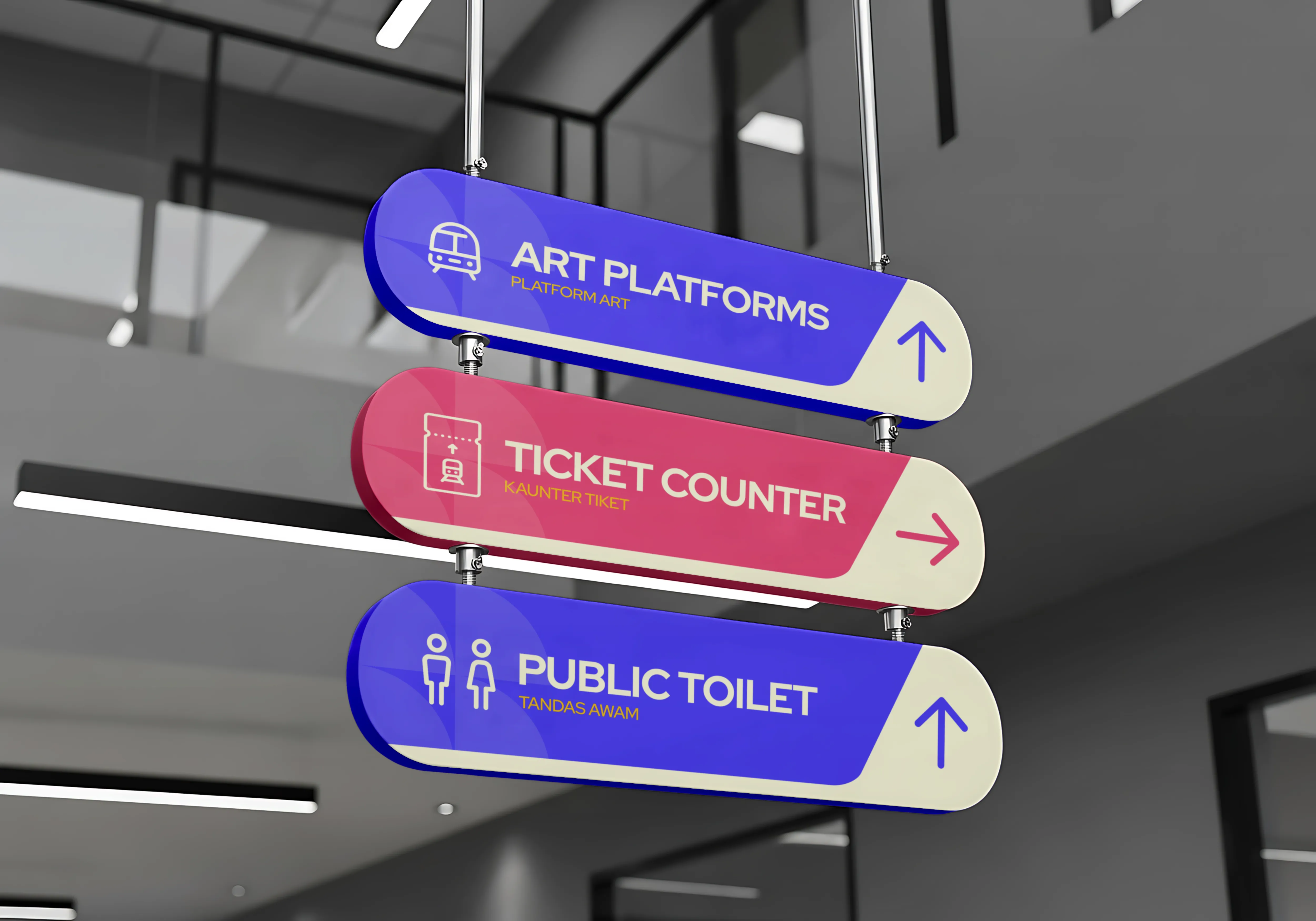
The project brings together a consistent wayfinding system across the Autonomous Rapid Transit (ART) station environment.
The project brings together a consistent wayfinding system across the Autonomous Rapid Transit (ART) station environment.
The project brings together a consistent wayfinding system across the Autonomous Rapid Transit (ART) station environment.


[STATISTICS]
[STATISTICS]
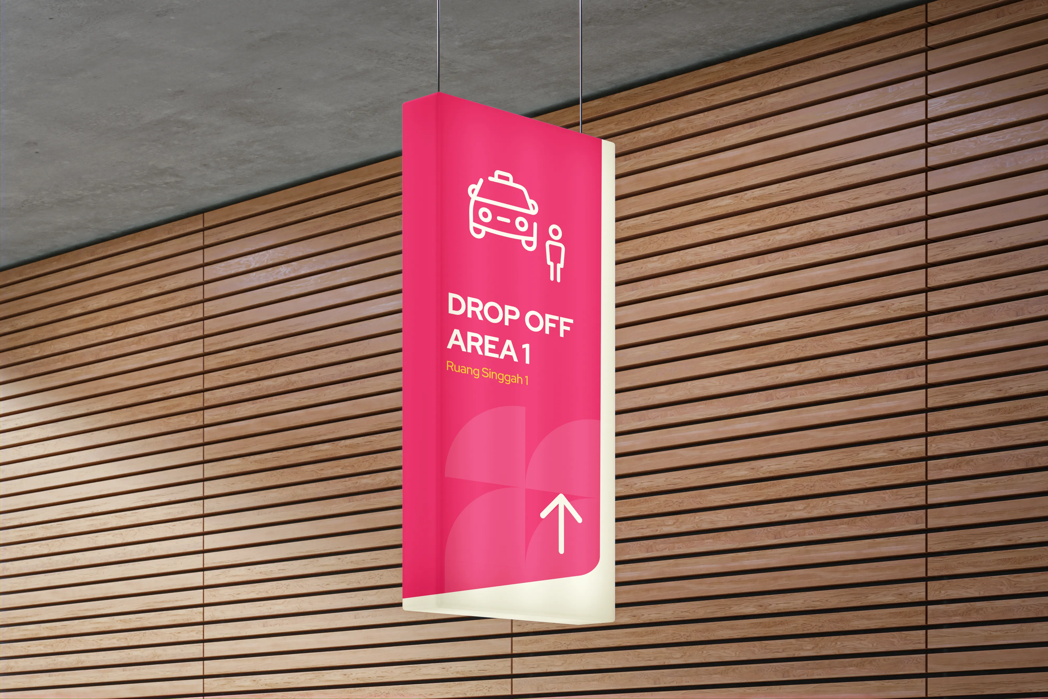
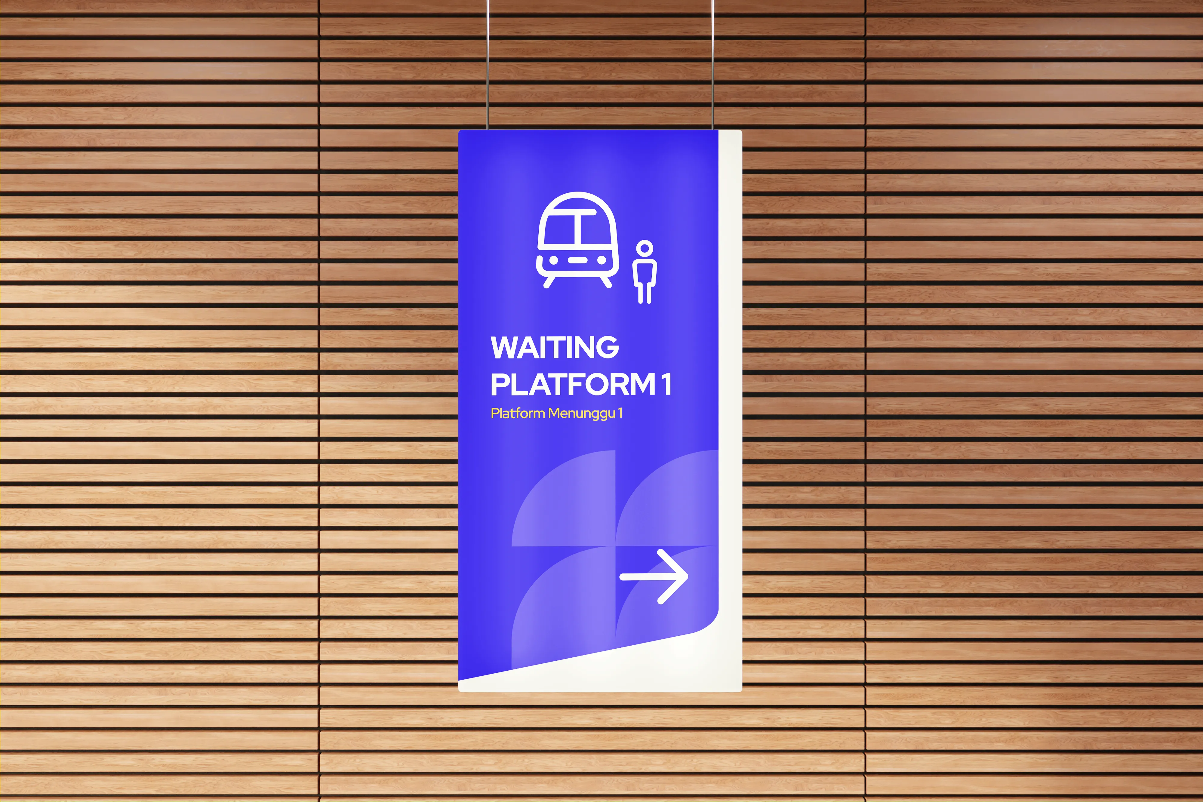
The signs are categories into three main colours, the darker blue are used in main signs, while the softer blue and pink are used in smaller signs for easier identifications of the signs and avoiding confusions, making the entire station feel connected and easy to navigate.
The signs are categories into three main colours, the darker blue are used in main signs, while the softer blue and pink are used in smaller signs for easier identifications of the signs and avoiding confusions, making the entire station feel connected and easy to navigate.
The signs are categories into three main colours, the darker blue are used in main signs, while the softer blue and pink are used in smaller signs for easier identifications of the signs and avoiding confusions, making the entire station feel connected and easy to navigate.
[SOLUTTIONS]
[SOLUTTIONS]
Simpler design execution.
Simpler design execution.
Designs that are repeatable.
Designs that are repeatable.
Visual identity and elements that are scalable and comprehensive to be used to build various collaterals.
Visual identity and elements that are scalable and comprehensive to be used to build various collaterals.
02x
02x
02x
FASTER DESIGN OUTPUT
FASTER DESIGN OUTPUT
02x
02x
02x
MORE CONSISTENCY
MORE CONSISTENCY
25%
25%
25%
LESS COLLATERAL FRAGMENTATION
LESS COLLATERAL FRAGMENTATION
[HIGHLIGHTS]
[HIGHLIGHTS]
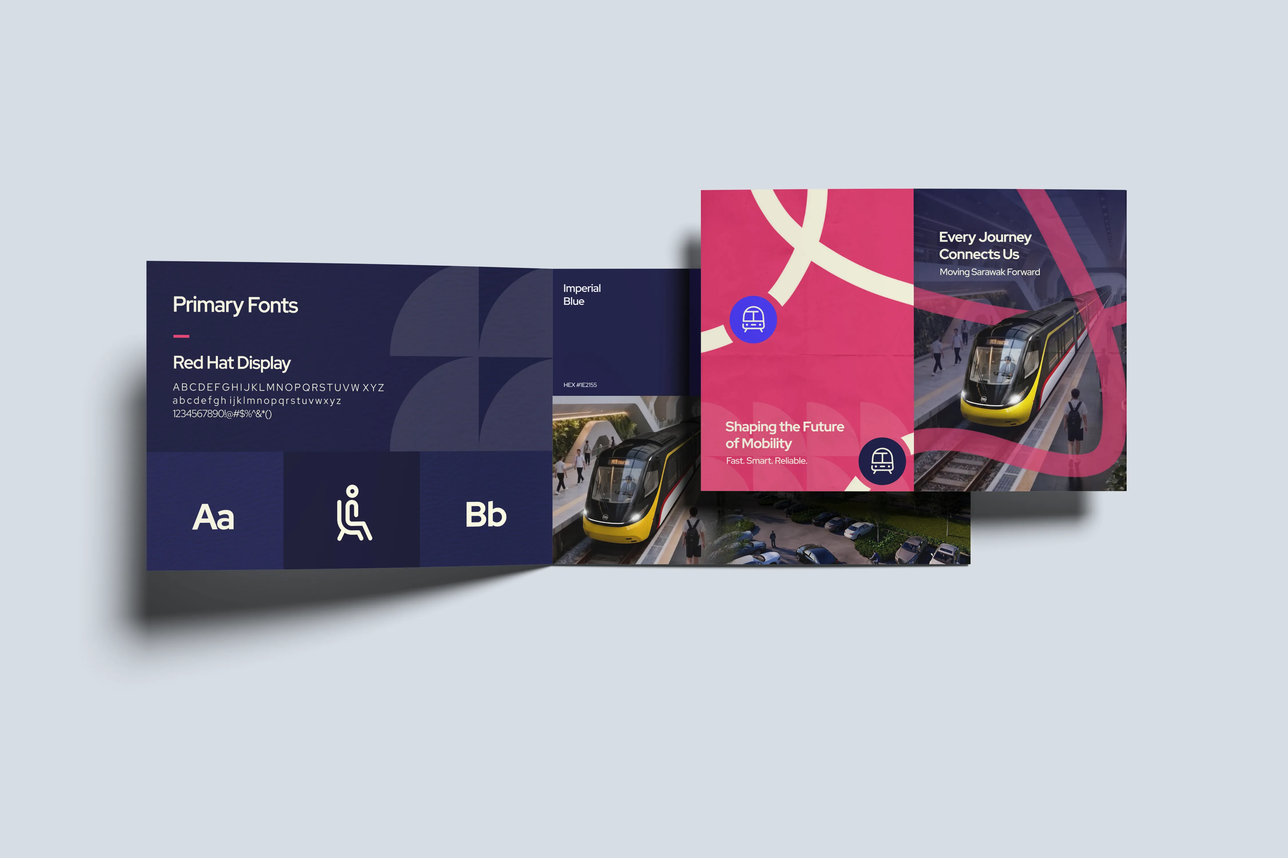
We built the wayfinding system around three core brand colours, a clear typeface and simple graphic elements to create a visual language that works across different station touchpoints.
We built the wayfinding system around three core brand colours, a clear typeface and simple graphic elements to create a visual language that works across different station touchpoints.
We built the wayfinding system around three core brand colours, a clear typeface and simple graphic elements to create a visual language that works across different station touchpoints.

[FINAL THOUGHTS]
[FINAL THOUGHTS]
The result is a wayfinding system that feels clear, confident and easy to follow. It brings together function and visual personality to create a station experience that feels modern without becoming complicated. More than simply telling people where to go, the system helps make the ART feel like a connected part of the city — approachable, recognisable and ready for the future.
The result is a wayfinding system that feels clear, confident and easy to follow. It brings together function and visual personality to create a station experience that feels modern without becoming complicated. More than simply telling people where to go, the system helps make the ART feel like a connected part of the city — approachable, recognisable and ready for the future.
[CONCLUSION]
[CONCLUSION]
Wayfinding doesn't have to feel complicated at all. Our vision for the Autonomous Rapid Transit (ART) wayfinding system is that, we wanted the experience to feel almost effortless— see the sign, understand the message, know where to go.
Wayfinding doesn't have to feel complicated at all. Our vision for the Autonomous Rapid Transit (ART) wayfinding system is that, we wanted the experience to feel almost effortless— see the sign, understand the message, know where to go.
Wayfinding doesn't have to feel complicated at all. Our vision for the Autonomous Rapid Transit (ART) wayfinding system is that, we wanted the experience to feel almost effortless— see the sign, understand the message, know where to go.